Calling All Critiques: Cover Art Entry #3

Thank you, J Edward Neill, for submitting your cover art entry to Calling All Critiques! We are so happy to post your book cover and give feedback.

To all those interested in critiquing the art below, please be constructive, proactive, and helpful. Not all feedback has to be positive, but it must help the author improve and/or let him/her know what s/he is doing right and wrong. Your feedback is important to the author, so please provide details and suggestions in a polite way. More info on how to critique here.

Please also make sure to check out our Rafflecopter giveaway for your chance to win two books and an Amazon gift certificate! Critique then enter!

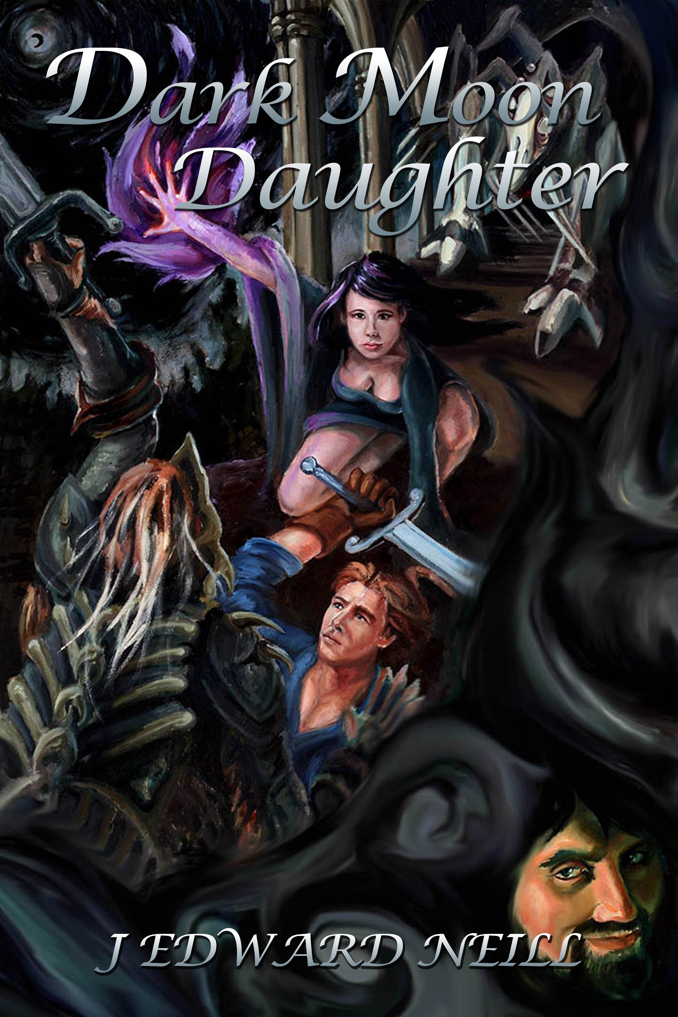
Author: J Edward Neill
Website: www.DownTheDarkPath.com
Book title: Dark Moon Daughter

Genre: Adult / Dark Fantasy

Dark Moon Daughter cover

Leave your critiques below! The author appreciates your feedback.

There’s more to critique!

After leaving your comments, you can head over to one or more of these blogs to see some more great entries:

Facebooktwitterredditpinterestlinkedintumblrmail
This entry was posted in Offers and tagged , , , , , , , , , , , , , . Bookmark the permalink.

5 Responses to Calling All Critiques: Cover Art Entry #3

  1. I like this cover. It’s very old school fantasy. It tells the story of your main characters–female MC and male MC fighting against an evil villain who sets monsters against them. We have action and movement and a snippet of the story telling us what we’re going to get. Plus it looks handmade by an artist, not stock, which is superb.

    I have a bit of an issue with the typesetting, though. It looks pasted-on to me. The words and font don’t blend into the graphic but just sit on top. Specifically, you’ve got parts overlapping key pieces of your artwork: The woman’s hand is underneath the “D” in “Daughter,” and the villain’s face is underneath the last two letters of the author’s name.

    If you can get the words to feel as though they’re part of the action scene somehow, I think you have a really solid cover.

  2. There’s a lot going on in this cover but my eyes instantly go to the girl. And based on the title I’m assuming she’s going to be the central character. There are moments when I’m not sure what I’m looking at (certain images) but despite that I think the title and cover work well to convey the genre.

  3. MM Jaye says:

    I tried to guess the genre just by looking at the cover, and what I came up with was YA fantasy. The fact that it’s hand-painted and that the MCs look quite young plus the smirking villain in the lower corner, give me a fairy tale-ish feel. It’s a beautiful cover, but I would suggest you add a tagline that would attract the right audience.

  4. raisingdaisy says:

    The first impression I got from the cover art was that this book is a YA graphic novel. The artwork itself is incredible, the artist is very talented. If the book actually is a graphic novel (I looked at your website but I’m still not sure if it is), then it works for that. But it does give me the impression that the book is geared to a younger audience. It definitely captures the “dark fantasy” part though!

  5. thekhabal says:

    Thank you all for the solid feedback. The art is actually a canvas painting by Eileen Herron. Like her painting for my first novel, this one hangs on my bedroom wall. It’s a bit eerie sleeping while the warlock in the lower right eyeballs me, but I’ve gotten used to it.
    Thanks again!
    J Edward

Comments are closed.